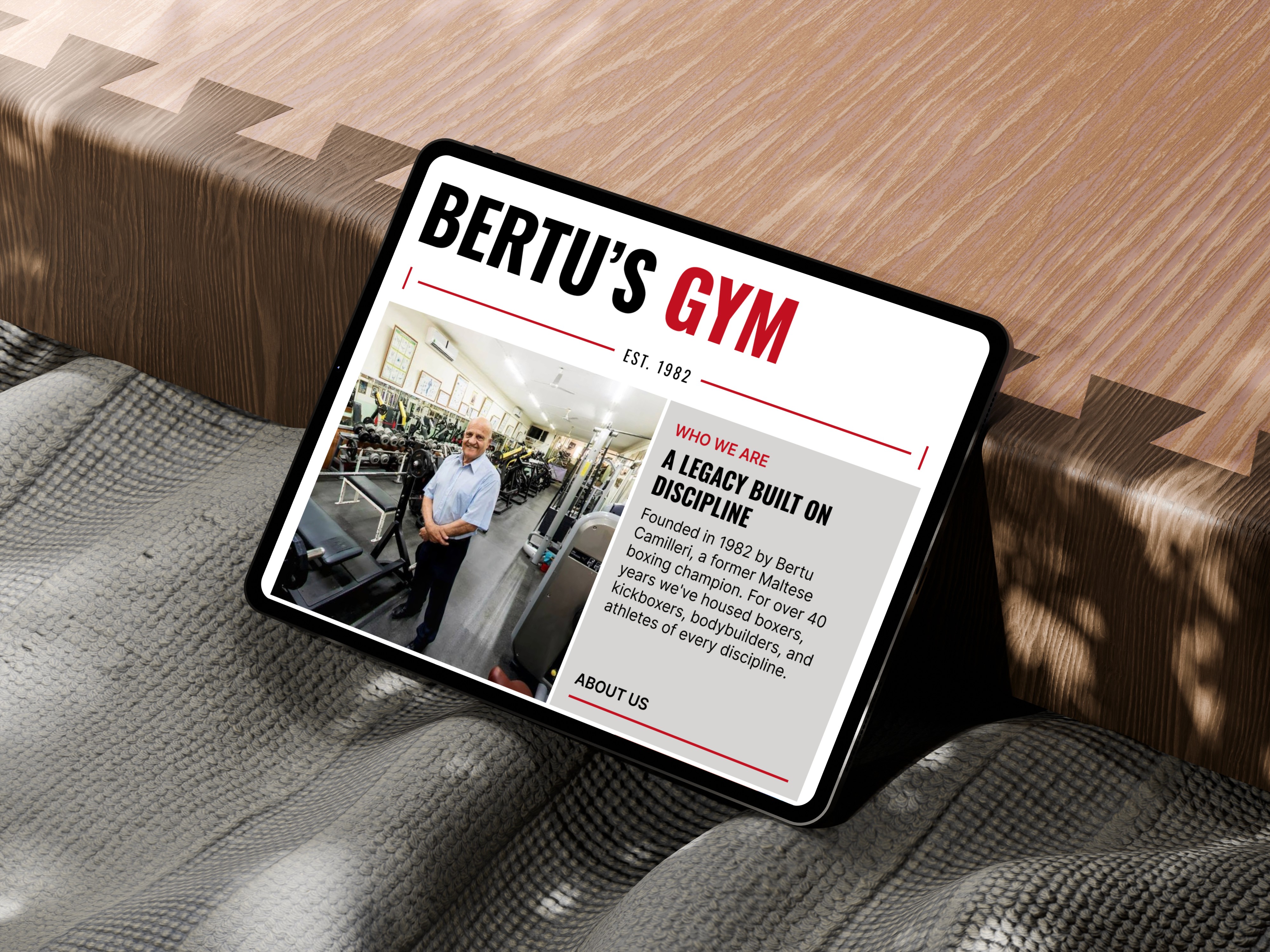
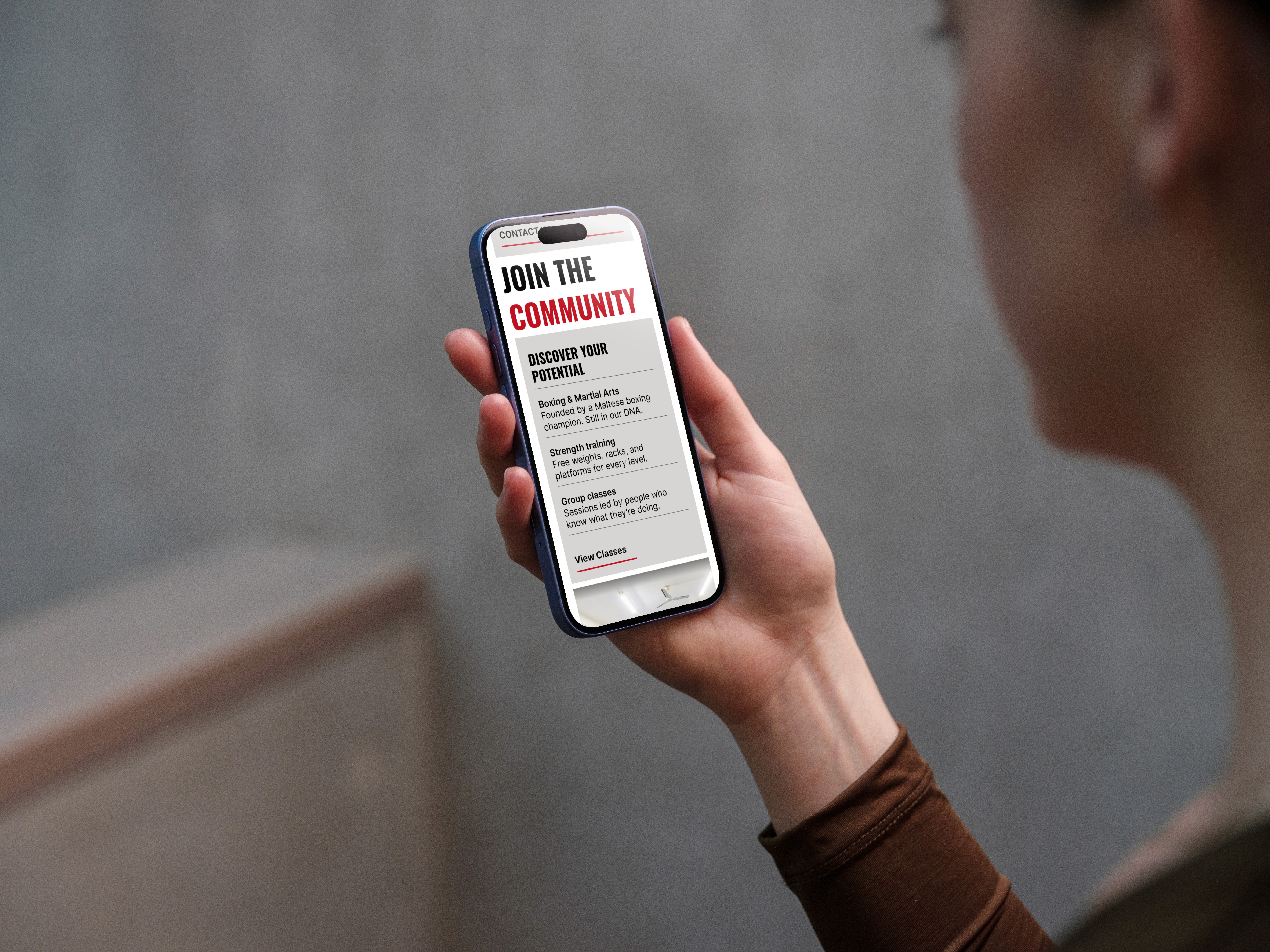
The Overview:
Bertu's Gym is one of the oldest gyms in Malta, running since 1982. This was self-directed spec work, a full responsive design built to give a gym with that much history a proper online presence for the first time.
The Opportunity:
Bertu's has one of the richest histories of any gym in Malta, something most gyms simply don't have, and yet it doesn't have a website at all. A place with 40 years, boxing roots, and a real story, with no presence online telling any of it.
That was the opening. Not to design another gym site with a hero shot of someone mid-lift and no soul behind it, but to build something around what actually makes Bertu's different, the things a chain gym can't copy.
The Work:
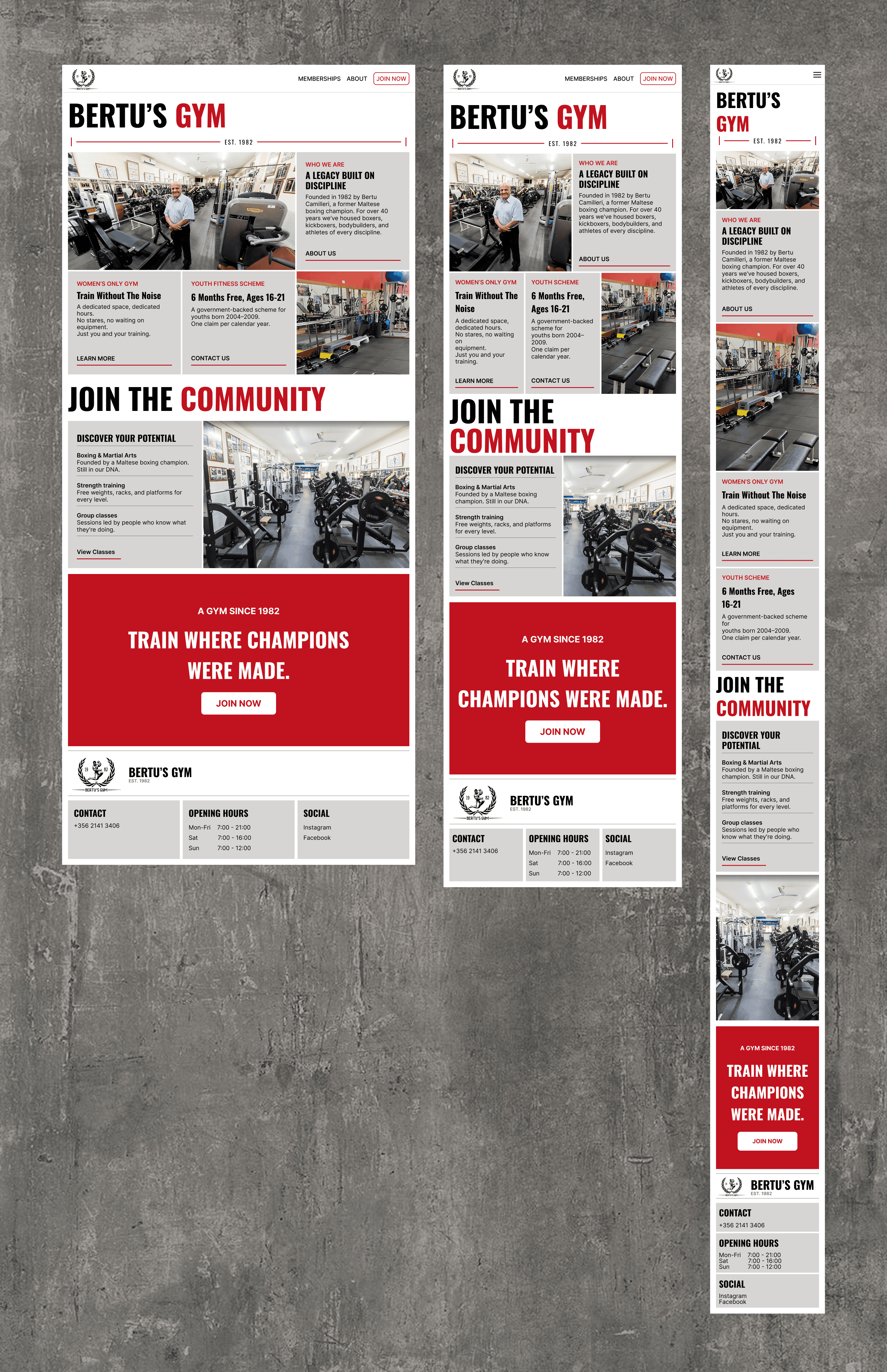
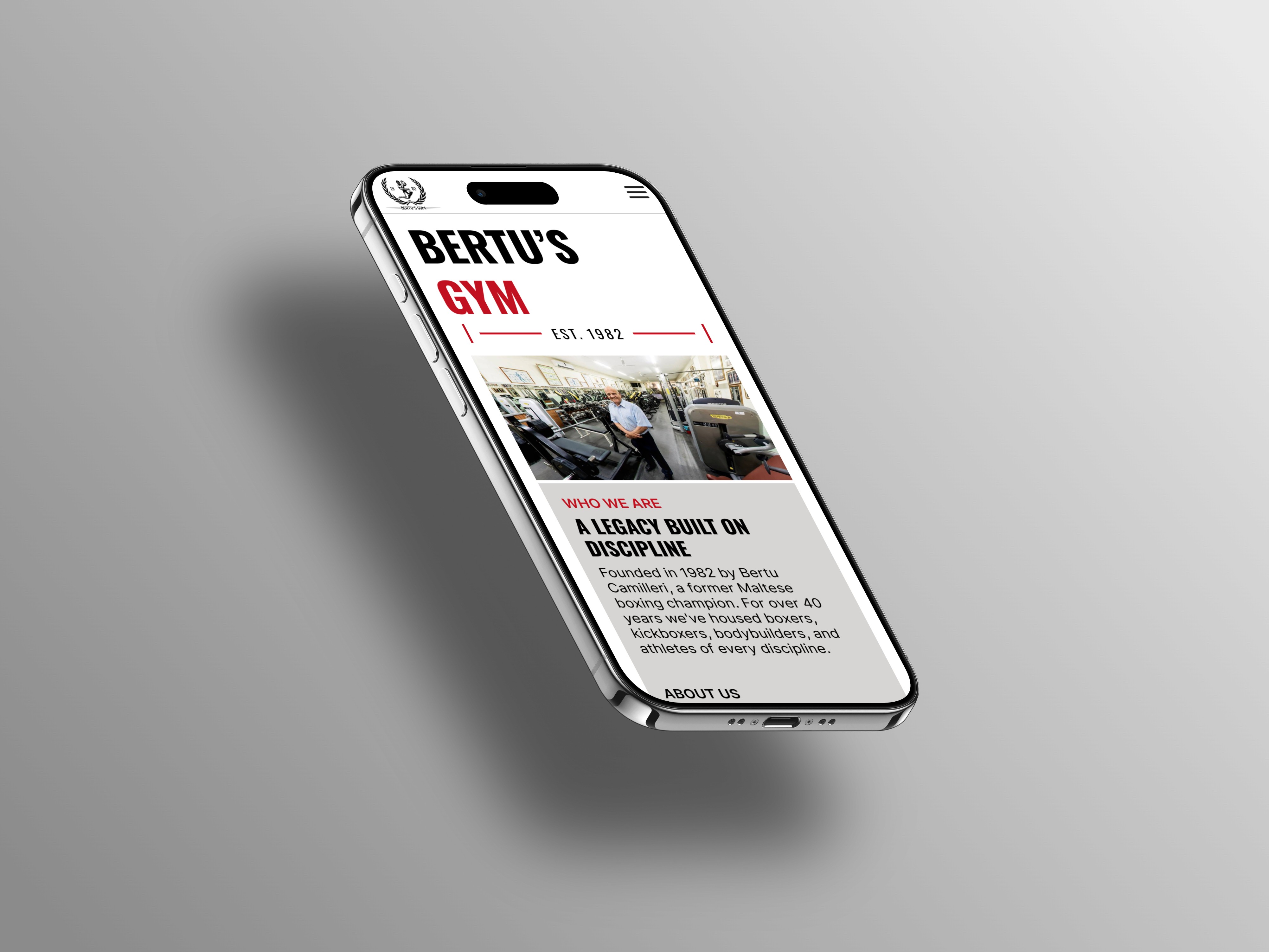
I led with the history. Who Bertu's is, when it started, and who founded it, before anything else. If the history is the differentiator, it should be the first thing you see. The rest of the page follows the same logic, ordered to build a case: history first, then what sets Bertu's apart, then the community, and one final call to action to close it out.
The colours came straight from the gym itself. Red, white and grey run along the walls of the actual premises, so the palette stays consistent with the real place. Same idea with the photography, real images of the gym rather than stock, so it looks like somewhere you'd actually train.
The two things people genuinely want to know about got real space too. The women's-only area is a proper differentiator from other gyms, and the youth fitness scheme answers the first question any kid or parent has, which is whether the gym is part of it. If someone didn't know it was, now they do.
The whole thing is built responsive across desktop, tablet and mobile, so it holds up wherever someone lands on it.